Shop Maria Huata Merchandise
Support the campaign and wear the kaupapa with pride.
Each item you purchase helps us build a stronger, more connected Kirikiriroa and carries the meaning and intention of our campaign identity: Tākina.

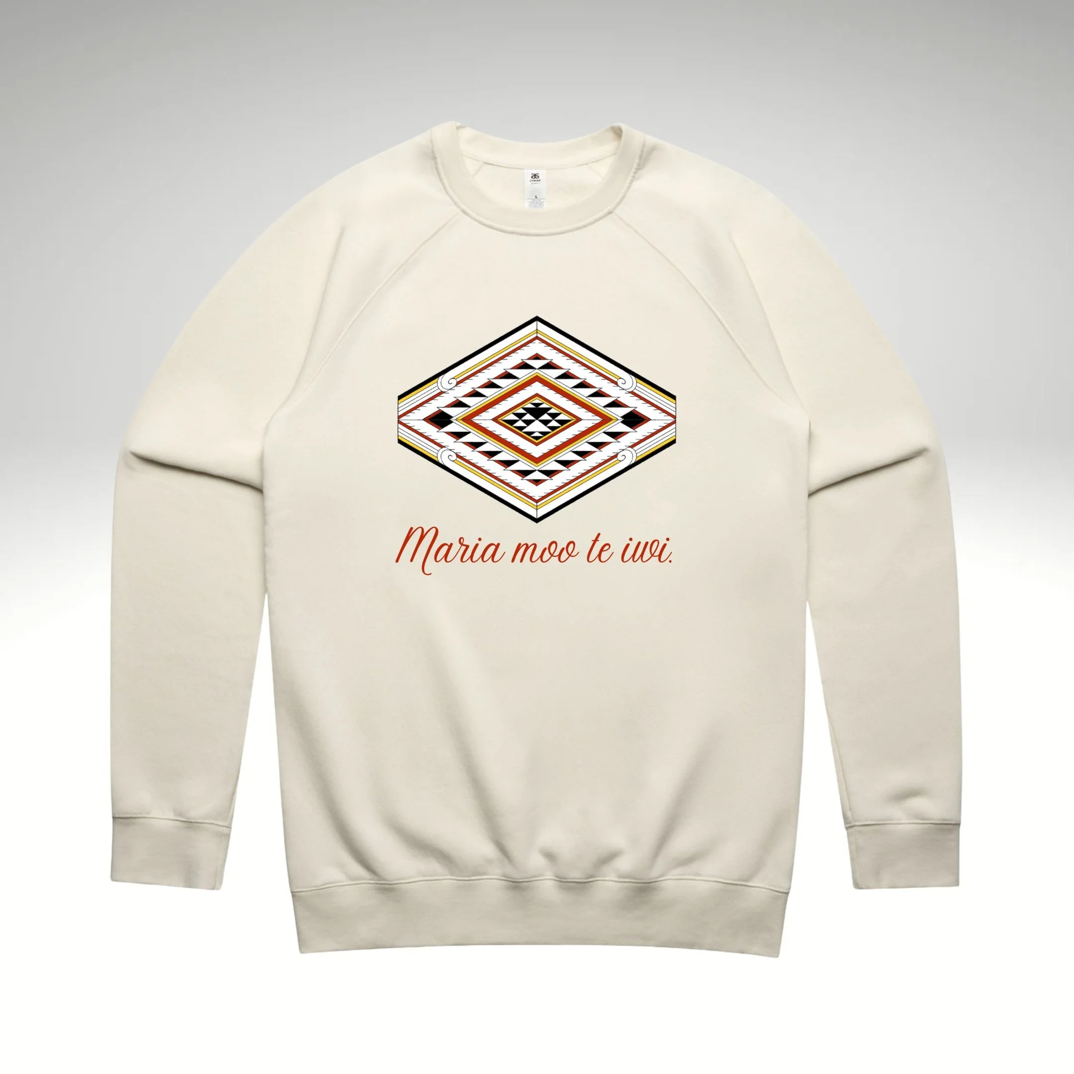
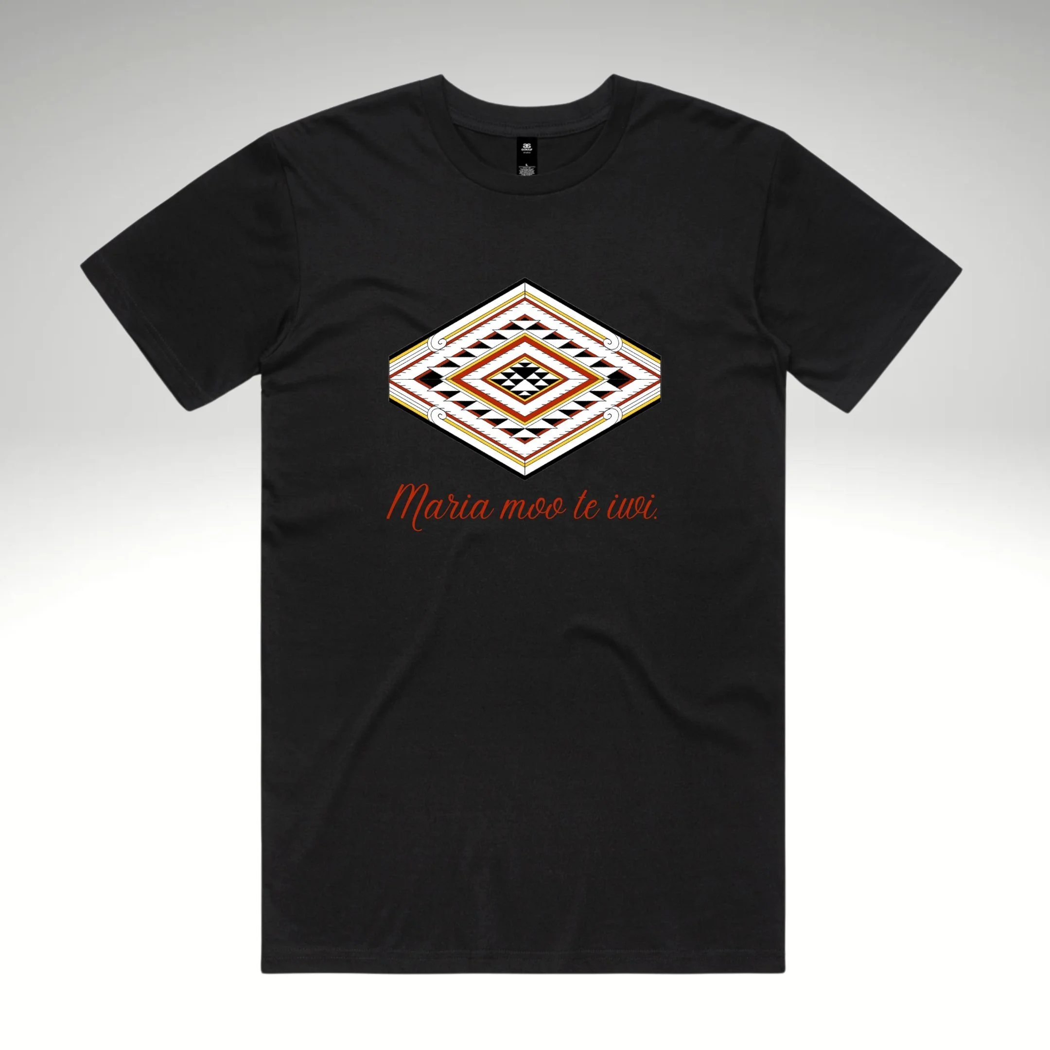
Tākina – The Design Behind the Movement
Tākina is the name of Maria's campaign logo, designed with aroha by her whāngai son, Jayden Hokianga of Hokianga Arts.
Tākina means:
To lead, to guide, and to serve your people. It reflects Maria’s lifelong commitment to being a visible, grounded, and kaupapa-driven presence in our communities.
Symbolism Within the Design
Pātiki (Flounder)
At the heart of the logo is the pātiki, a symbol of abundance – not just in resources, but in heart, intention, and community spirit.
It represents our shared responsibility to care for one another and move together with purpose
Four Koru
The four koru reflect the four winds, symbolising inclusivity.
No matter your background, denomination, or ethnicity, everyone matters in this movement.
Colours of Waikato
Black – Unlimited potential
Red – The people, the source of strength
Yellow – The ultimate energy that drives transformation